
Decomposition Chart Builder: Google Ads Script
Decomposition Chart Builder
A Google Ads Script

Share
Important Links
You’ll need to make a note of these to use the Decomposition Chart Builder script:
- Google Ads Script: WeDiscover GitHub
- Google Sheet Template: make a copy
Video Walkthrough
Introduction
The best charts don’t just tell you what has happened. They give you insight into why it has happened. When trying to understand trends in an account there can be many contributing factors, making it difficult to be sure you’re monitoring them all effectively and have a truly well rounded view of all aspects of performance. That is why we’re big fans of decomposition charts.
These take an outcome (e.g. conversions) and then break it down into the components that drive performance in that area, to visualise the individual contributors behind a wider point. They help to tell a story, identifying what works well and what does not, thus making it simpler to know what to work on improving next. In this article you can:
-
- Learn how to read a decomposition graph and understand your performance at a deeper level
- Set up your own, interactive decomposition chart on any Google Ads account, using our open source script and template
- Learn how to use the decomposition sheet to aid your reporting
Reading A Decomposition Chart
Looking at how efficiency is measured internally within a business and then breaking out all of the components within that allows you to identify the biggest pain points, the best areas for growth, the areas with the largest potential for improvement and more.
Let’s think about conversions. As a key metric, you might want to compare conversions over two different time periods. At its simplest, this could be reported as a raw number, e.g. “conversions rose by 15”.
A slightly more sophisticated method could use a table to display the change in conversions over that period alongside some other key metrics, using raw numbers and percentage changes, as shown in the image below:
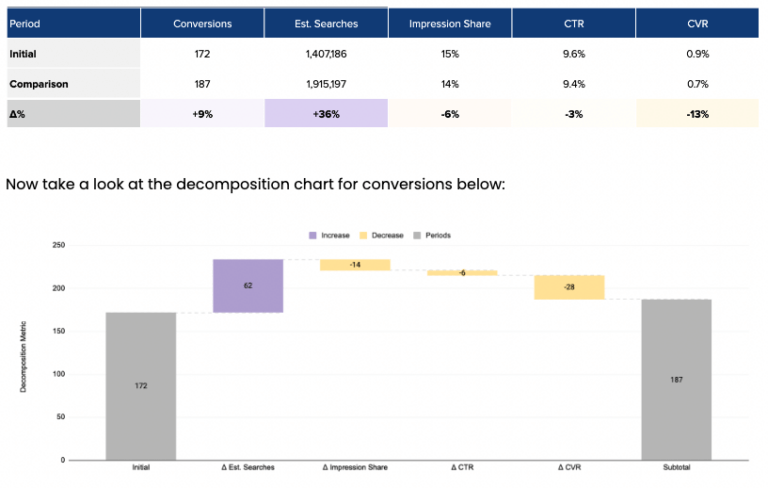
The grey bars on the far right and left compare conversions at the two different time periods. In between all of those are a number of other metrics. These are carefully selected micro-factors that feed into the change in conversions. A purple bar represents when there has been a positive change in one of these metrics that would have supported driving an increase in conversions. A yellow bar represents an area where there has been a negative change that has hindered performance.
This visual representation makes it clear to identify specific pain points. In the example above, we can see that a drop in conversion rate has occurred over the time period, while click-through rate also saw a very small drop. The impact of these factors has been outweighed however by a very large uptick in estimated searches, leading to an overall rise in conversions.
This quick identification then helps facilitate a further conversation around account management and strategy. Breaking down results in this highly visual but also granular way can save time in daily reporting; making trends easily identifiable at a quick glance. It also makes them perfect for sharing performance insights with those less familiar with or more removed from in-platform metrics, helping for example to tell a story to stakeholders that can be clearly and illustratively explained.
Instructions For Setup
In order to create your own, interactive decomposition graph, begin by making a copy of this Google Sheet template document and this script.
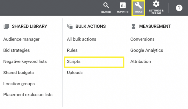
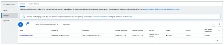
Sign in to your Google Ads account and click on the Tools icon at the top of the screen. In the drop-down that then opens up, under Bulk Actions select Scripts.
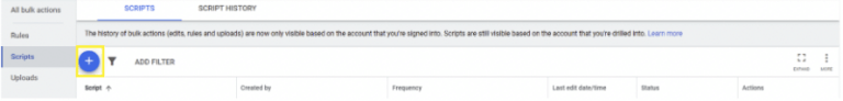
Click on the blue “+” icon to create a new script.
Be sure to delete anything that is already in the box for the script insertion in Google Ads first, then copy and paste the full script from GitHub into Google Ads.
You may choose to edit the script name at the top. This will allow you to easily differentiate between the different scripts you enter.
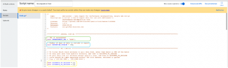
The top section of the script contains ‘user configs’, which are editable by you to make the script work specifically for you. The remaining ‘do not edit’ section below makes the script work and should not be edited.
Under ‘URL of spreadsheet’ (highlighted in the green box in the screenshot above), remove the XXXX and copy and paste the URL from the template sheet you saved earlier inside the quotation marks.
Below that, you can select the number of days you wish to include in your export of data from your account to your sheet [blue box]. It is set to 180 days by default, but you may edit this if you wish. This will impact the date ranges you can view in the decomp chart.
If you are applying the script at MCC level, then you may also wish to use the section below that [yellow box]. Here you can include details on any accounts within the MCC that you wish to either include or exclude in your data export.
Note you can choose to provide account IDs to either include or exclude – not use both functions simultaneously. If providing multiple account IDs, they should be comma separated with dashes, and enclosed in single quote marks inside the square brackets. For example:
[‘123-456-7890’, ‘345-6789-0123’]
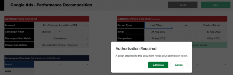
Once all of your details have been entered, set the script to run and authorise it when prompted, to allow it to access the account. Note that if you authorise before you run the script, you may have to repeat this when you press run.
Following the above steps, a query will be created to pull raw data from Google Ads and create two new hidden tabs in your sheet. You do not need to open or interact with these in any way.
You can set the script to run at any desired frequency – our recommendation is once daily (usually first thing in the morning, so it is up to date while you use it across the day).
Once the script has run, you can navigate to your decomposition GSheet and start using your new tool immediately.
Using Your Sheet
The ‘controls’ area at the top of your ‘Performance Decomposition’ tab allows you to influence what your report shows.
This dynamic reporting gives the ability to explore specific areas of your accounts and understand what has driven performance at a very granular level, without having to create or work through several pages of reports.
Controls: Entity Selection
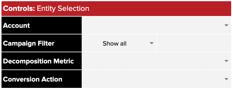
Account: if you have set up your sheet to work across multiple accounts, here you can select which of those you wish to show the data for.
Campaign filter:
- Selecting ‘show all’ here will show data from your entire Google Ads account.
- Very often however it is useful to break down your performance to deep dive into what is happening in specific areas. To do this, you can use the ‘contains’ or ‘does not contains’ filters. How you choose to use these depends on the naming convention you have set up in your account.
- An example may be that you use the ‘contains’ filter and type ‘shopping’ in the box alongside, to show only performance for shopping campaigns, if your naming convention allows.
Decomposition metric: select the metric whose performance you most want to understand and breakdown. This is the metric that will show in the grey bars on your chart. You can choose from:
- Conversions
- CPA
- Conversion value
- ROAS
- Conversion action: the values listed here will update dynamically according to the conversion actions available in your given account. It will usually be most helpful here to view data for the primary conversion action in your account however; understanding the performance of any secondary metrics can sometimes go a long way to understanding your full funnel journey and breaking down performance at a deeper level.
The chart can show a breakdown for only a single action at a time. If you have multiple primary conversion actions in your account, you will have to view this separately.
Controls: Period Selection
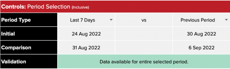
Under period type, you can select a fixed period type (last 7 days, last month etc), or custom.
When selecting a fixed period type, you will see the top right box populate with three comparison options: previous period, previous period (-1) and (-2). In practice this means that if you are in September and select last month vs previous period, you will be looking at data for August vs July. If you select last month vs previous period (-1), you will be looking at data for August vs June.
If you choose instead to use the custom period, you may enter the dates you wish to compare into the rows below. Ensure you use the format shown (DD MMM YYYY). Note that while you can compare any time periods of your choice, comparing periods of an equal number of days will usually provide the most fair comparison of data.
Once you have completed filling in the details in your “Controls” tables, hit “Run” at the top of your sheet. The first time you do this you will be prompted to authorise your script – hit run once more after doing this to populate your sheet.
Performance Overview
This is another interactive table, that time lets you decide which metrics you want to view data for – you can view up to 7 at a time.
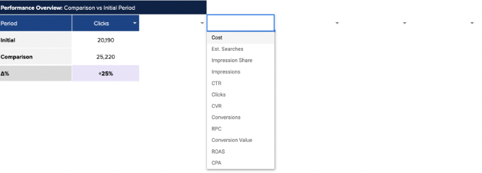
Clicking the drop down arrows across each column enables you to select a metric – you may select from a choice of 12. This will then show the values for that metric for the time period you have selected.
The final row (∆%) shows the percentage change between the two periods being compared.
Decomposition metrics
Below that, the decomposition chart is viewable – refer to the section above ‘Reading a decomposition chart’ for more details on interpreting the data shown there. A further explanation is shared in the video linked above.
One consideration to make when using this tool is the way the data export works from Google Ads. In instances where you are running campaigns that do not have the ability to export impression share statistics (for example, Performance Max campaigns) it is assumed that these campaigns have 100% impression share.
Final Note
Reporting underpins everything a digital marketer, or even a company, does. It shows how what you’re doing is working (or not), facilitates understanding test results and informs optimisations.
Measuring the performance and value of an account allows for actionable insights to be gleaned based on hard data. This means that the better your reporting, ultimately the better the performance that you can drive.
We’d love to hear how you’ve found using our decomposition tool. Contact us and share your experiences.